Designing for dark mode
Designing for dark mode as an afterthought can be really tricky. Here are a few things you can try that might help you be more successful 🧵

It’s a popular opinion that you simply just need to invert the colors. Instead, try using the same visual cues as the light version — close elements should still be lighter and distant elements should still be darker.

With dark mode, it’s harder to create depth because shadows aren’t as visible. Instead of relying on the absence of light, try creating reflective surfaces to add depth. This can be achieved using a combination of light borders and light inner shadows.

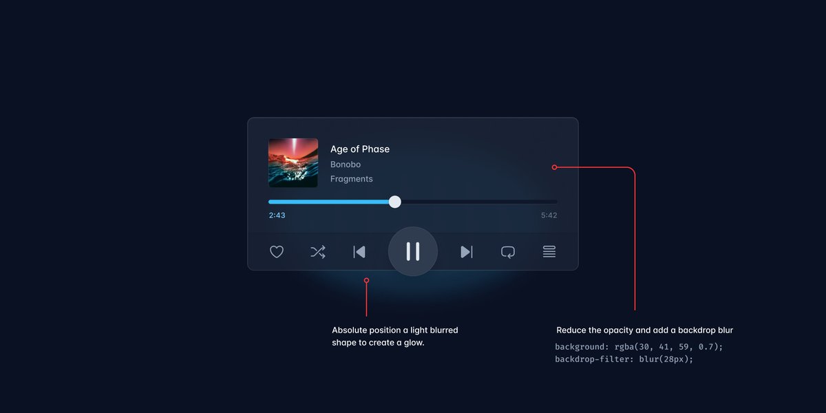
A hack to create additional depth is to add a light blurred shape behind the element to create a “glow” effect. If you’re feeling fancy, reduce the opacity and add a background blur to the foreground element so the glow shows through creating a “glassy” effect.

If you're looking for more inspiration, we used a bunch of these tricks on the Tailwind CSS website: tailwindcss.com

Documentation for the Tailwind CSS framework.